823.91/ Project Information
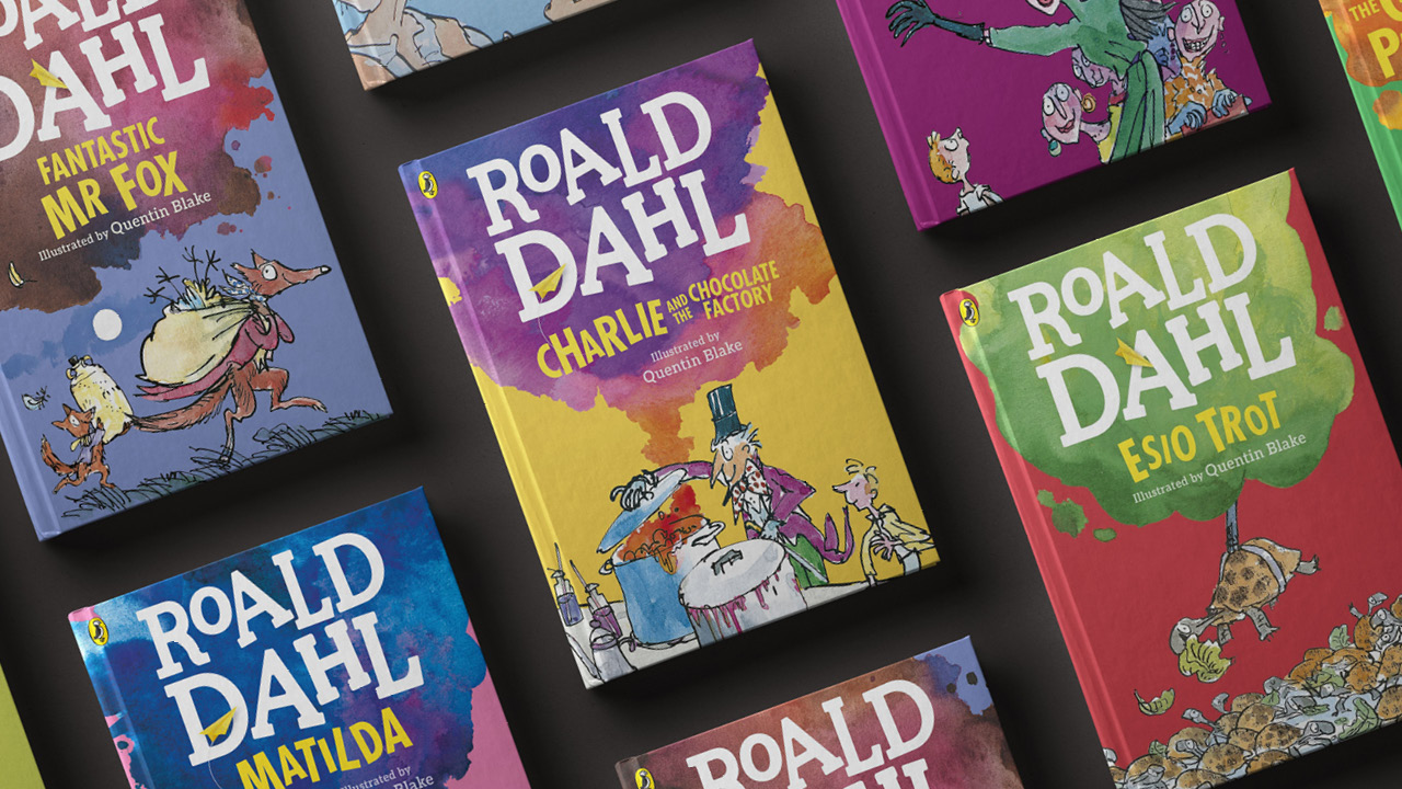
The imaginary worlds of Roald Dahl are filled with exciting stories, gruesome tales and intriguing characters. Synonymous with all of this are the illustrations of Quentin Blake. Together they have captivated the minds of children and adults for decades. The two were so intertwined that The Roald Dahl Story Company needed to create a recognisable identity that could have a life and character of its own.
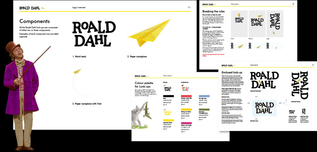
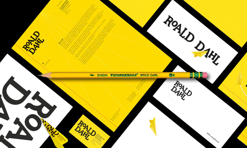
Forming the basis of the brand mark is the distinctive higgledy-piggledy typography, mischievous in nature and as colourful as Dhal’s many characters. Often accompanying the word mark is a yellow paper plane that at times brings additional mischief and disruption to the letters.
This playful and unconventional logo and wider branding system has enabled the Dahl Estate to have a clear brand presence for not only all his books but across film, theatrical recreations and at the Dahl Museum.
Categories: Identity/ Branding/
Acknowledgments: Design for Sunshine x The Roald Dahl Story Company/